I’ve been getting into philosophy recently, and it’s teaching me something: many things I don’t agree with have valid arguments behind them.
“He who knows only his own side of the case, knows little of that.”
Understanding the other side can make your convictions stronger. It can also make you realise you need to change them. I wanted to bring what I was learning about philosophy and debating into something people could pick up, understand, and argue with for themselves.
That became 2 Minds, the daily philosophy puzzle I built for Shipaton. I started on August 1, alongside my full-time job. By September 17, it was on the App Store. It has now shipped to the App Store, Google Play, and Samsung Galaxy Store from one codebase.
Between those dates, I spent a surprising amount of time thinking about how a paragraph should appear, what changing your mind should feel like, and why something that looked perfectly fine on Android was doing something strange on my iPhone.
I used Kotlin and Compose Multiplatform for almost the entire app. That gave me time to care about those details. It also gave me plenty to learn.
What should an answer look like?
2 Minds is a library of puzzle challenges built around questions philosophers have argued about for decades and centuries. Each one opens with a scenario you can picture, then asks you to take a side.
Your answer determines which situation and question comes next. At every step, the other mind makes its case, and you can either hold your position or take it back. Over three questions, the app keeps asking you to think about what your answers commit you to.
By the end, you’ve met a new concept and formed an opinion you’ve had to defend. The close explains what philosophers have argued about it, and the Sources screen gives you citations, notes, and links to keep reading. Afterwards, you can revisit the route you took and open answers on the other branches to discover the arguments you didn’t meet.
I had one rule for the result: I didn’t want to tell someone they were “73%” a particular kind of thinker.
The questions are meant to leave you thinking. A score felt like it would close the conversation too neatly. Instead, your answers gradually lean toward six philosophical temperaments, each with a gem and a colour. Your record grows, and the app begins to wear the temperament you have been expressing.
You first meet those temperaments during onboarding. The carousels introduce their definitions, gems, and reveal animations, so you get an early feel for what the colours mean. Later, when your own answers change the theme, there is a reason behind it.
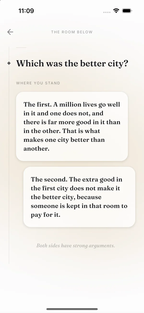 iPhone 16 simulator · Puzzle
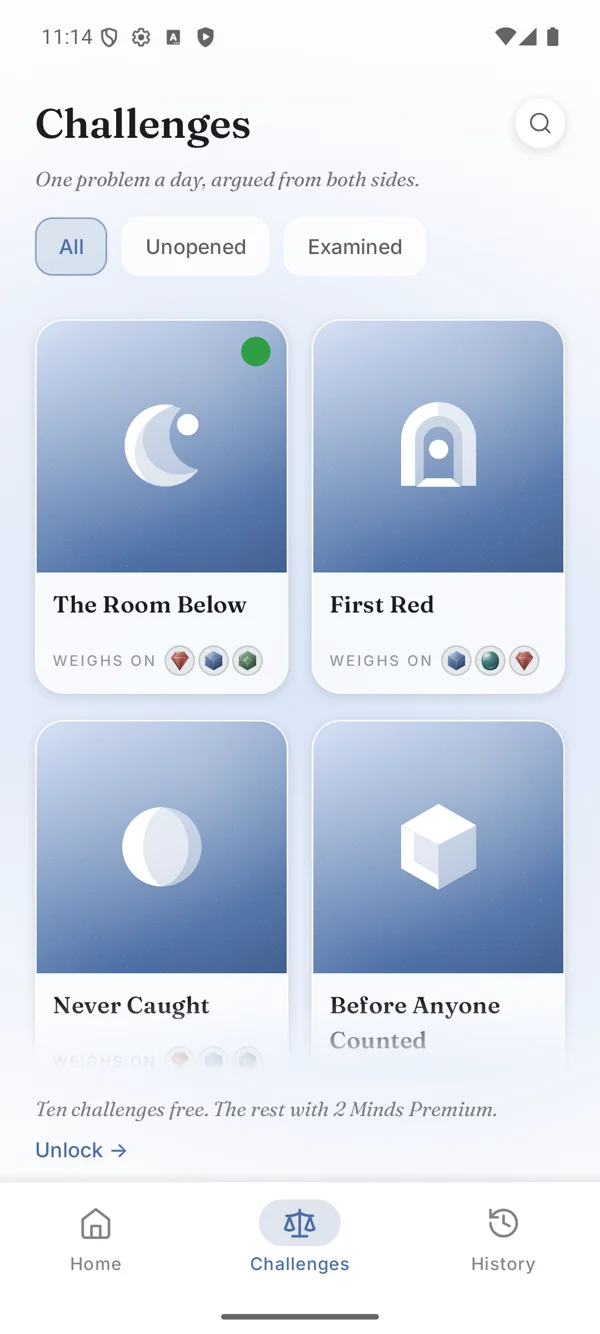 Pixel 8 emulator · Challenges
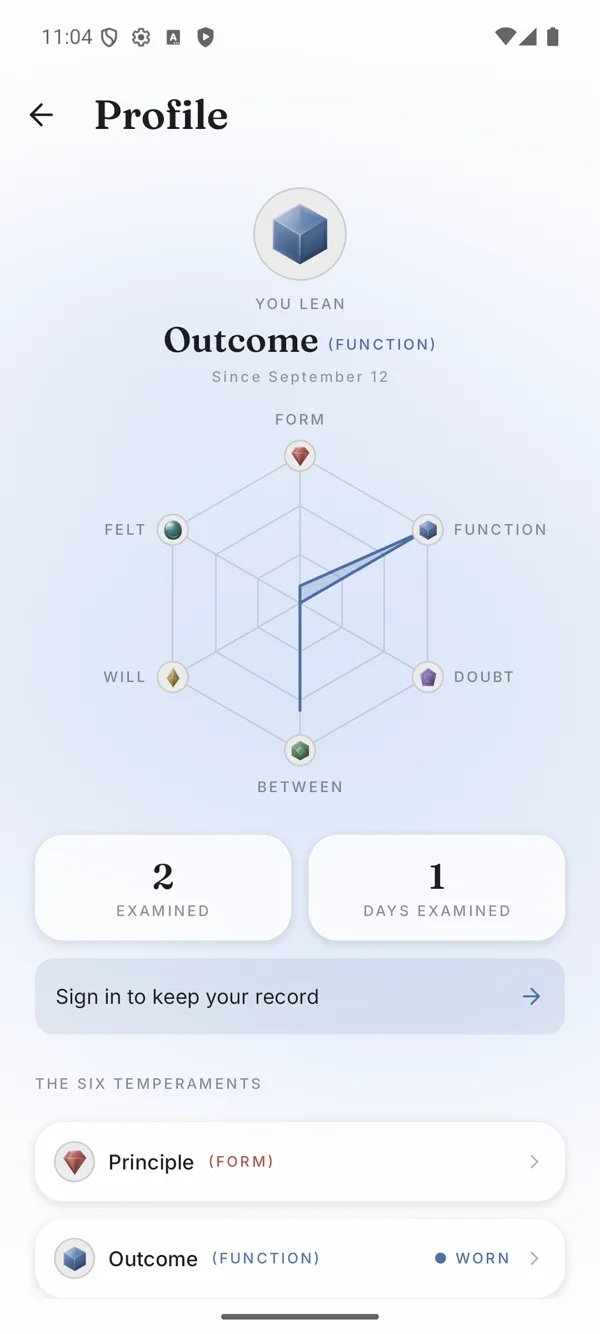 Pixel 8 emulator · Profile
The first challenge was engagement. Philosophy needs paragraphs, and those paragraphs are competing for attention with everything else on your phone. I couldn’t just add two buttons below a wall of text and hope the subject would do the rest.
That led me to the galley: a vertical feed of full-screen beats, borrowing the familiar rhythm of TikTok or Reels. Here, you’re moving through an argument. Text appears as you reach it, and choosing, holding, or taking something back becomes something you see and feel.
I wanted the text to have room. I wanted the answer to feel considered. And I wanted the other mind to arrive at the right moment, when you had actually committed to something it could challenge.
Those decisions turned a fairly small app idea into a much more interesting project.
I could only afford to build this once
With a full-time job and a Shipaton deadline, I needed the work I did on one platform to count on the other.
Compose Multiplatform let me share the screens themselves, along with the animations, themes, puzzle rules, database, sync, and billing integration. When I changed the way an answer appeared, that change reached Android and iOS together.
About 97% of the app’s handwritten Kotlin and Swift source is shared. That figure comes from a source-line count, excluding tests, comments, and generated code. The practical benefit was much simpler: I could spend an evening getting an interaction right without spending the next evening recreating it for another platform.
There is still platform-specific work. Apple sign-in, network monitoring, and haptics need their own implementations. I kept those behind small interfaces so the rest of the app could ask for what it needed without knowing how each phone provided it.
This grew from an approach I wrote about in my earlier article on platform-specific dependencies. It was satisfying to take something I had explained in a smaller example and use it throughout an app I was actually shipping.
The Swift side is seven small files and some configuration, covering Sign in with Apple, Google Sign-In, Firebase setup, and network monitoring. Android supplies its own sign-in and connectivity pieces. Thin Kotlin adapters handle haptics, font loading, and the database path on each side. Each app shell hands its native pieces to shared code once, at startup.
The shared code saved time, and I would need that time later.
A theme switch became the ending
I wanted a theme change to feel like a little event. The new theme would spread through the old one instead of replacing it all at once. For this project, I created ThemeReveal, which became a separate library other developers could use.
When it came into 2 Minds, it found a purpose. At the end of a puzzle, a gem lands, and the new theme can emerge from that point. Your answer changes the space around it.
The effect works by drawing two live versions of the screen. One has the current theme. The other has the incoming theme, gradually uncovered by an animated shape. Once it fills the screen, the old version goes away.
I liked that both versions could stay alive during the transition. The content didn’t have to become a frozen screenshot while the animation passed over it.
Then I discovered what “two live versions” actually meant for the rest of the app.
The puzzle ending already had a scroll position and animations in progress. Creating another copy could give me a fresh ending at the top of the page, while the original was halfway down. For a moment, the two versions disagreed about what the reader was doing.
The solution was to move that state above both versions. They could have different colours, but they needed to share the same scroll position, the same answers, and the same animation progress.
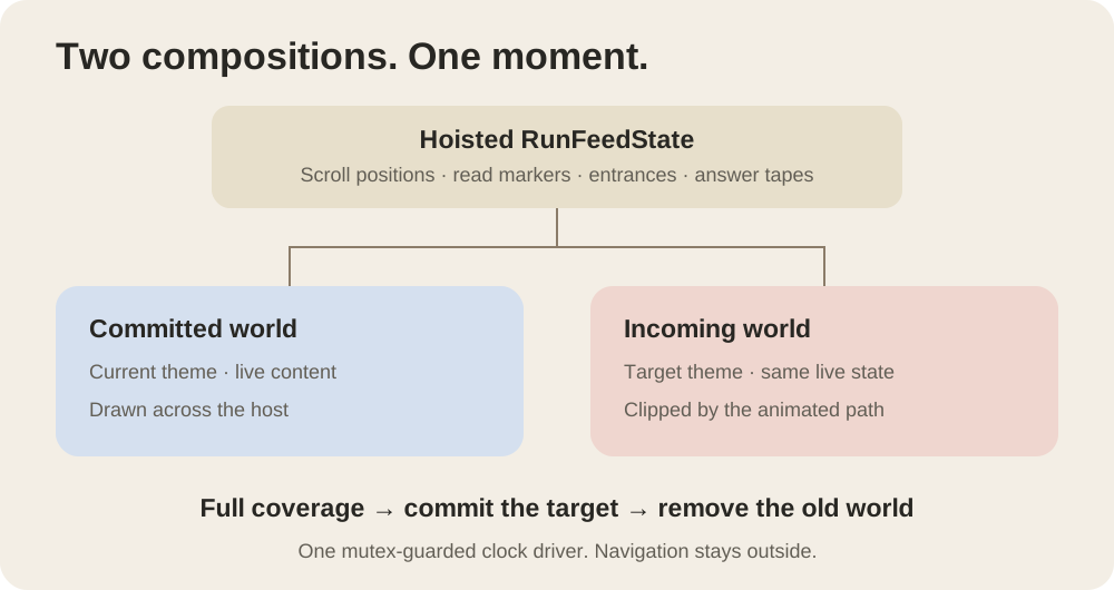
That was one of the most useful Compose lessons in the project. I understood state hoisting before this. Having a second version of my screen visibly wander off on its own made the reason for it much harder to forget.
I also kept the reveal’s changing progress in the drawing and placement work, so moving its edge didn’t make Compose rebuild the screen on every frame. The effect still costs work, of course. I just wanted that work spent on the animation you could see.
Eventually the reveal felt like it belonged to the puzzle. Getting there required more thought about state than I had expected from something that began as a colour change.
Reading took more work than the animation
I built the puzzle as a series of full-screen passages. You scroll through a passage, and when you reach the end, continuing the drag starts to turn the page.
I also wanted a quick flick to stop at the end of the text. It shouldn’t throw you into the next part before you had read the current one.
That distinction gave me trouble. The pager and the scrolling text each had ideas about who should handle the gesture. At one point, a page could get left between positions. Another part of my gesture code was waiting for information that the pager had already consumed.
I eventually read the pager’s source and gave the page-turning behaviour one owner. The text gets to scroll first. When it runs out, the remaining drag can move the page. Letting go settles it according to how far you moved.
It is a small interaction to describe, but it matters in use. The reader should be able to stay with an argument without thinking about the scrolling system underneath it.
Choosing an answer needed the same care. The answer you leave behind gets a pen stroke through it. Your chosen answer is marked, your claim appears, and the other mind responds.
The core screens and answer choreography started in Figma. In Compose, I built a small timeline system for the entrances, stamps, strikes, and rewinds, then connected those moments to scrolling and visibility. Text waits until it comes into view, and the scene clock runs only while something is moving.
My first implementation still drifted from the design. The timings were slightly different. So were the spacing and colour. Each difference was small; together they changed the feeling.
I went back to the frames and rebuilt against them. That taught me to stop treating a description of an animation as a substitute for watching it.
“TAKE IT BACK” was another surprise. Playing an entrance backwards sounded like the obvious solution. In practice, parts of it waited around and then snapped away. I had to give the outgoing movement its own timing so reconsidering an answer felt as deliberate as choosing it.
You hold an answer for three seconds to continue, with little haptic ticks as the bar fills. If you let go, it drains back. For someone using a screen reader, there is an immediate action instead of a timed hold.
These were the details I kept returning to. The whole app asks you to think carefully about a choice. The interaction should give you time to do that.
Then I spent more time on the iPhone
Sharing the interface meant I had the same screens on both platforms. It didn’t mean I could stop testing them separately.
The search field was a good example. It grows open when you tap search. On my iPhone, the keyboard’s first appearance could interrupt that animation and make the field seem to stall. I had requested focus immediately, before the opening had finished.
I moved the focus request to the end of the animation. The field could open first, then the keyboard could follow. My Android emulator, which wasn’t showing a soft keyboard, had given me no reason to notice it.
The iOS bounce found another problem. In the Challenges screen, the cards bounced while the search-and-filter band stayed behind. They were meant to look attached, but I had applied the bounce to only one part of the layout. Moving the effect to their shared container brought them back together.
Haptics took their own round of adjustments. Some effects didn’t produce anything on certain platforms or Android versions. Others were technically working but felt too similar to one another. I ended up giving the app a small vocabulary of ticks, commits, and page turns, then choosing the appropriate effect on each platform. On iOS, keeping the generators prepared also mattered for the first beat.
There were visual surprises too. During a back swipe, a line appeared between two screens because their background glows started from different positions. And Profile needed drawing work after I found that the gems were repeatedly creating gradient brushes during redraws.
I also cared about the familiar way out of a screen: Android’s back swipe and the iOS edge swipe both needed to work with the custom interface. These were the details that made the features feel finished.
This is where I appreciated sharing the rest of the app. I had room to work on the differences. But I also learned to be careful with the phrase “it works on both.” There is a lot between a screen opening successfully and a screen feeling right in your hand.
The foldable gave the book idea somewhere to go
Agentic coding made it much easier to try different layouts and form factors. Since 2 Minds is an app you read, I took the chance to build for foldable postures. The extra space could do more than hold a stretched phone screen.
On a wide, flat screen, the puzzle can open into a two-page spread. On a device held half-open like a book, those pages should already be there. Animating an imaginary book opening on top of a real fold felt unnecessary.
On an Android foldable such as the Galaxy Z Fold, the app reads the hinge posture before deciding from screen width alone. Hold it half-open like a book and it skips the opening movement: the story goes on the left, your choice on the right, with a shadow down the crease.
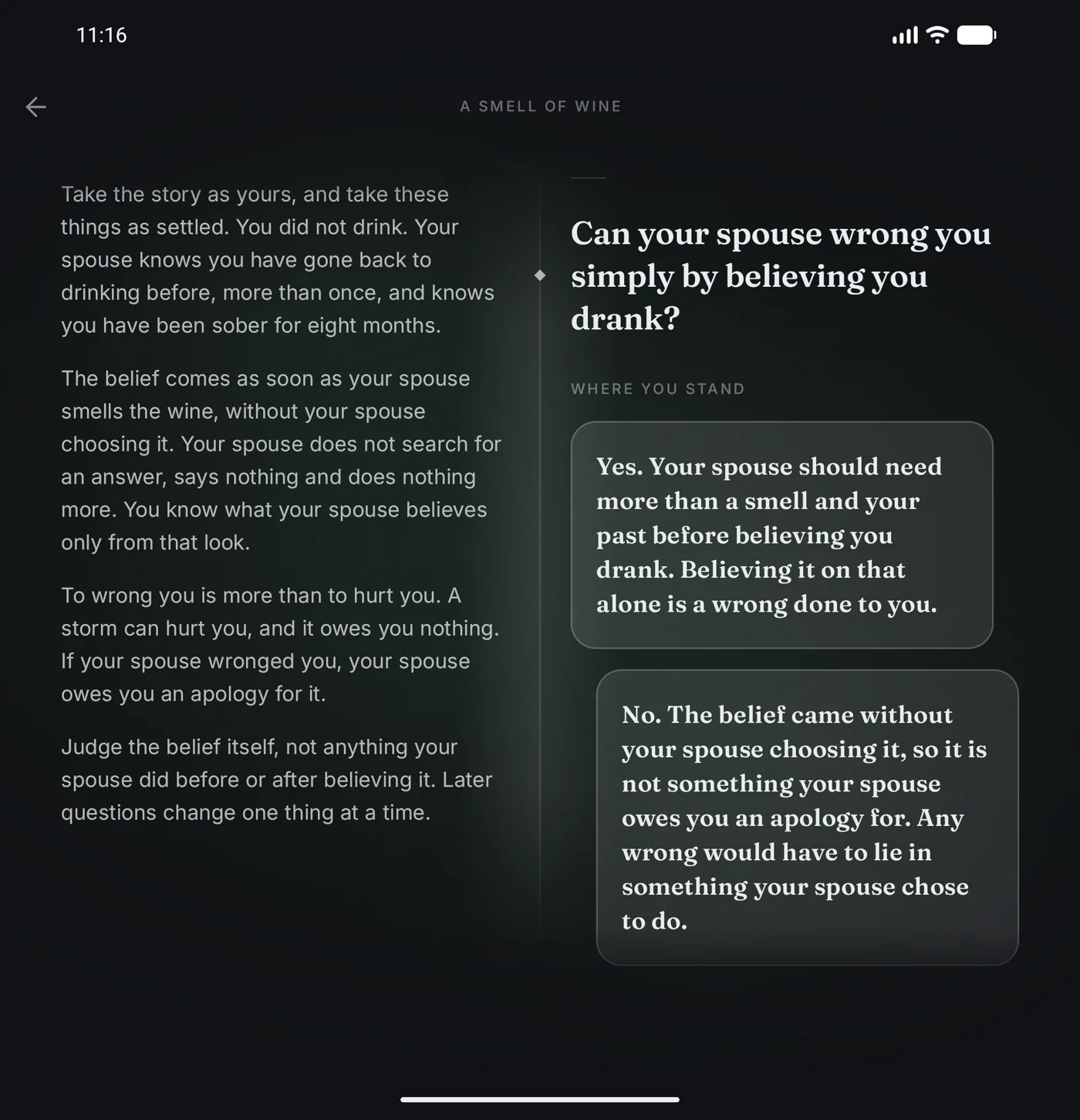
One bug came from the posture information arriving just after the screen first appeared. The app briefly used one layout, then changed to another, but could already have marked the scene as read. Remembering that state separately for each layout fixed it.
I enjoyed this part because it made the device feel relevant to the design. On iPad, the wide layout gets a similar spread, selected by the available width. Apple also announced the iPhone Duo while I was still building. The timing gave me a chance to test a few of my screens on it.
Testing the Duo also exposed a limit in the shared tools. In the version I was using, Material 3 Adaptive didn’t report iOS hinge postures. The wide layout could work, but the Android-style half-open trigger wasn’t available. I raised it in the Kotlin community, and support is tracked in CMP-10856. That distinction mattered: sharing a layout and detecting how a device is folded are separate problems.
The less visible parts had to earn their place too
Underneath all the motion, the app still had to keep your answers safe, work with stored puzzles, and cope with losing its connection.
Room uses the bundled SQLite driver, so Android and iOS run the same SQLite version. Firebase, through GitLive, handles sign-in, content and record sync, and analytics from shared Kotlin.
RevenueCat’s KMP SDK handles purchases across all three stores, along with its Customer Center. Android has two flavours from the same code: Google Play Billing for Play, and Samsung In-App Purchase for Galaxy. The iOS shell supplies its App Store configuration.
Sync was where I had to resist making the solution more complicated than the problem. I tried a background queue to coordinate work, then looked at it and decided the code had become too confusing. The simpler version has a few clear moments when syncing happens, and makes them take turns with account deletion.
A spinner that could wait for minutes taught me a similarly direct lesson. Remote calls needed time limits and a useful failure state. A slow connection shouldn’t leave someone wondering whether the app had forgotten them.
The experience only works if both halves hold up: the argument has to be worth reading, and the app has to let you read it without getting in your way.
Every branch needs to hold up
Getting the app to work was only part of the job. The puzzles needed a consistent shape and a standard of reasoning I could stand behind.
Each challenge has an opening and three branching levels: seven questions, fourteen answers, and eight possible routes. A reader follows just three questions, but I have to care for every branch. The answer someone doesn’t choose still has to make sense.
I used multiple LLMs to critique drafts and look for weak arguments or questionable assumptions. Then came the human work: checking sources, reading each route, and deciding whether the counterargument actually challenged the position someone had taken. A convincing paragraph isn’t enough if it answers the wrong question.
This is why a puzzle can take so much work. It needs research, but it also needs to be readable. I want someone to understand the problem without already knowing the philosophy behind it.
Some of the work could leave the app
I shared pieces of the project while I built it: the theme ceremony, the Past Puzzle History screen drawn on one Compose canvas, and lessons from foldables and the iPhone Duo. I also introduced the project on X. Those posts gave me a way to explain the work while it was still fresh.
The theme reveal started as something I wanted for my own UI. By the end of the project, it was useful enough to extract.
I published Compose Theme Reveal as an open-source library on Maven Central. It supports Android, iOS, desktop, and web, with twelve reveal styles. 2 Minds still uses the in-repository version it was extracted from, while the standalone library has continued to grow.
The lesson about sharing state between the two screens went into its documentation. I would quite like the next person to avoid finding that one out in the same way. You can try the Compose Web demo, find it on Maven Central, or read the release post.
My compose-alert-banner library got an update too. I released version 1.0.0-rc03 during Shipaton, adding custom colours so alerts could wear the app’s temperament. 2 Minds uses it for notices such as signing out, and the release is on Maven Central.
While building the licences screen, I found that JavaScript bridge replies containing a quote, a backslash, or a line break could be silently dropped. I traced the problem to the shared path every platform used and submitted PR #410 to compose-webview-multiplatform for issue #347. 2 Minds ships with that patch; when I submitted this story, the PR was awaiting review.
I’m glad those pieces became something other developers can use. They each came from a specific thing I needed to get right in 2 Minds.
The part I nearly called good enough
I gave up in my head so many times.
There were plenty of moments when I wanted to stop working on the puzzle sequence and call it good enough. But that sequence is the app. If reading, choosing, holding, and reconsidering didn’t feel right, the rest wouldn’t make up for it.
Design was perhaps my greatest struggle as a developer. Making something attractive was only part of it. The harder question was whether someone could understand what was happening while giving the app ordinary, imperfect attention.
I kept pushing and refining it. Seeing a puzzle run from its opening through to the closing gem makes me proud that I stayed with it. I’m glad I’ve built something positive, something that could help people learn and think through an opinion for themselves.
I’ve spent the past eleven years building mobile apps and publishing them on Google Play and the App Store. This was my first launch on the Samsung Galaxy Store, and it was refreshing to experience a different store’s submission process. It also marks the third personal project I’ve launched independently, without any company affiliation.
That work is why I’m entering 2 Minds for four Shipaton awards: the RevenueCat Design Award, the RevenueCat Peace Prize, Ship Kotlin Everywhere by JetBrains, and Best App for Galaxy by Samsung. Each speaks to a part of what I was trying to build: thoughtful design, better understanding, a shared app experience, and care for the devices people use.
There are more questions to ask
I have about forty puzzles lined up for the app. Growing that library is the next job, and each one needs the same care with research, reasoning, and readability.
After that, I want to let puzzles grow beyond three symmetric levels. The current structure gives every challenge a clear shape, but some arguments deserve another step. Some branches need more space than their neighbours. I want the structure to follow the question further.
Kotlin Multiplatform made it possible to put this much work into one app experience and bring it to both platforms. Along the way, I learned why two live screens need shared state, why an animation can look roughly right and still feel wrong, and why I should reach for the iPhone earlier.
My favourite part is still the ending of a puzzle. You’ve taken a side, heard the objections, and decided where you stand for now. A gem lands, the theme changes, and the app carries a little of that decision forward.
That was the idea I wanted to ship. I just didn’t know I would have to compose the screen twice to get there.
Try 2 Minds on the App Store, Google Play, or Galaxy Store, play a puzzle in your browser, or have a look at Compose Theme Reveal.
For fellow Kotlin developers: the stack
This build uses Kotlin 2.4.10 and Compose Multiplatform 1.12.0. Alongside ThemeReveal, the custom nested-scroll layer, and the choreography engine, shared code uses:
- Room with bundled SQLite for the database.
- GitLive Firebase for authentication, Firestore, and Analytics.
- RevenueCat’s KMP SDK and Customer Center for purchases.
- Navigation Compose with typed routes, and Koin for dependencies.
- Coil 3 over Ktor for images, and compose-webview-multiplatform for web content.
- Material 3 Adaptive for layout decisions, with the iOS posture limitation described above.
The platform shells supply the native services at startup. That boundary is the approach I described in Calling platform-specific dependencies in Kotlin Multiplatform.